Pergalė Chocolates Rebrand
22/06/2023
Situation
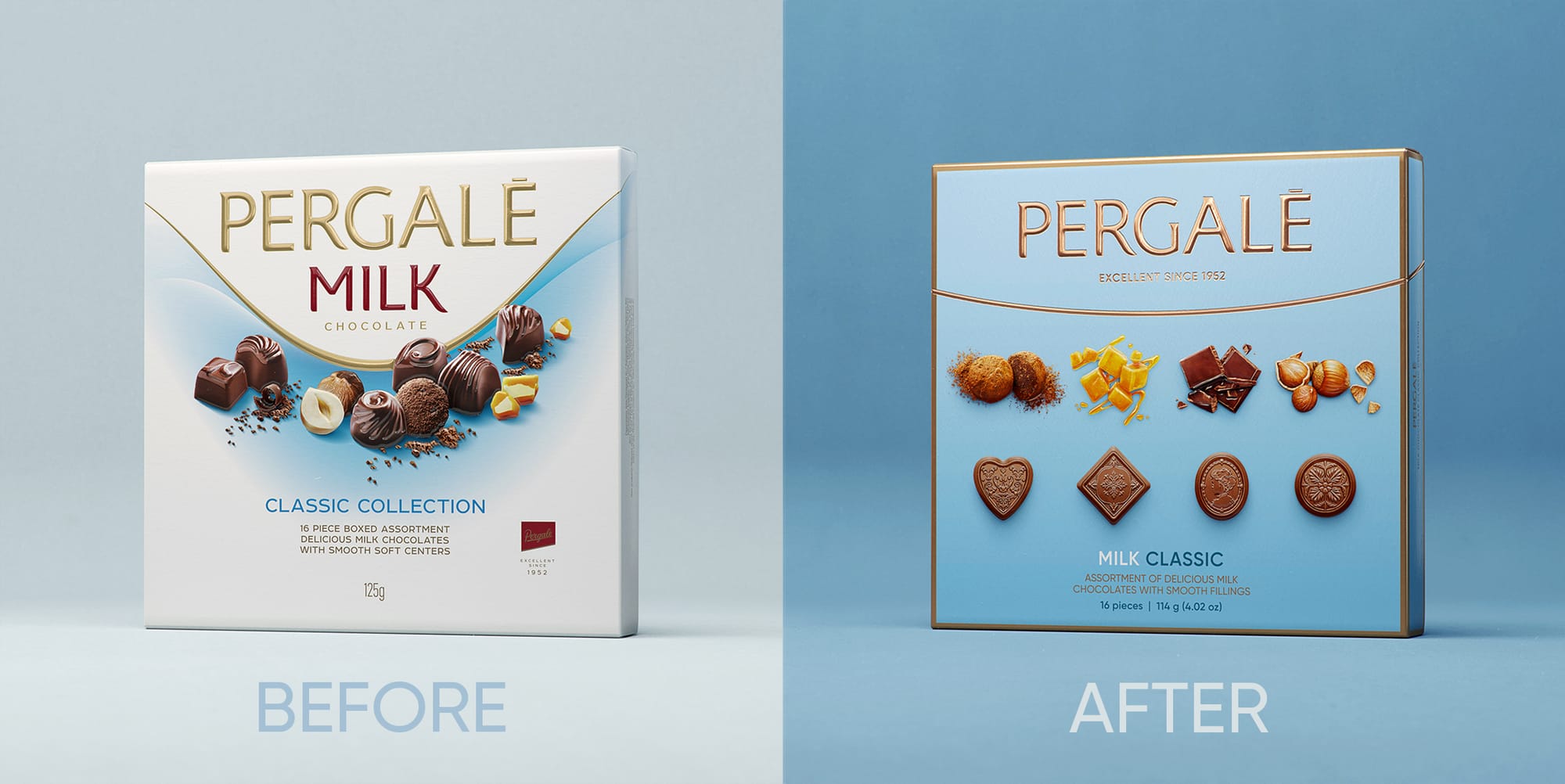
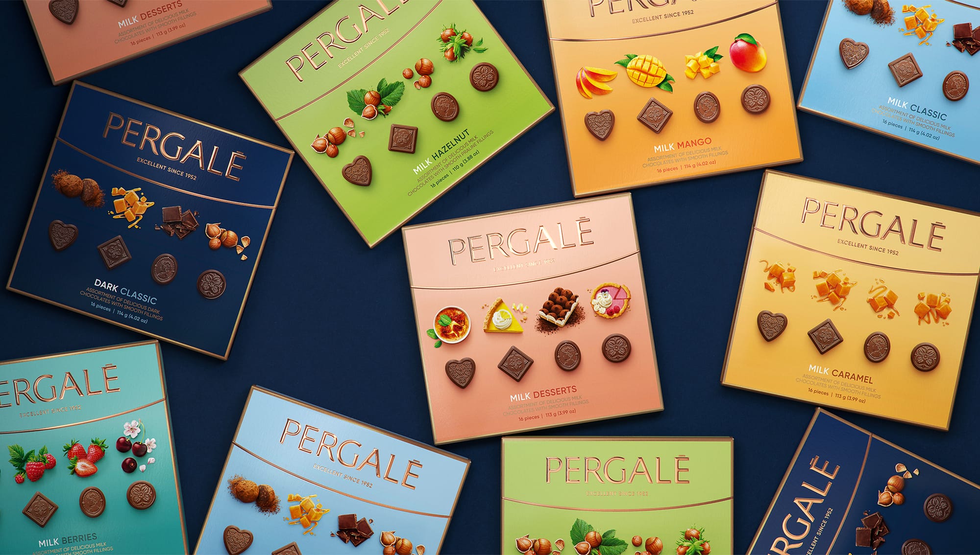
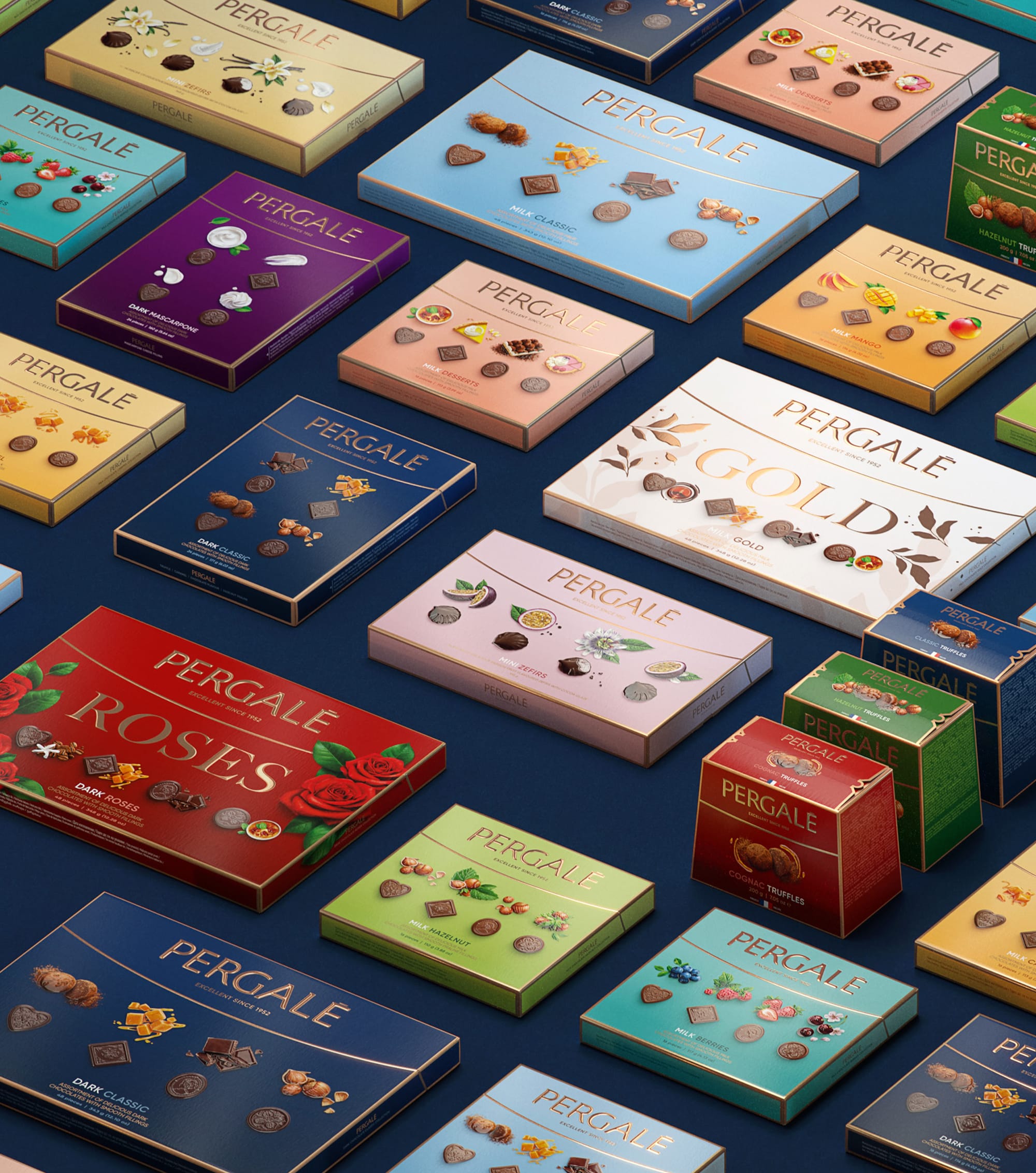
Pergale is one of the oldest and most popular chocolate manufacturers in Lithuania exporting to more than 45 countries globally. Having their last rebrand more than 10 years ago, Pergalė was in desperate need of a new look and feel. As our target audience was middle-class older people, it was crucial not to alienate them whilst still aiming for a more lively look to attract a younger demographic. We achieved this by going with a soft gradient background colour, life-like product illustrations and copper foil details
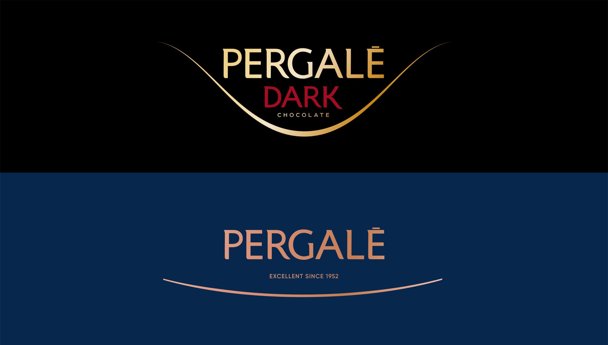
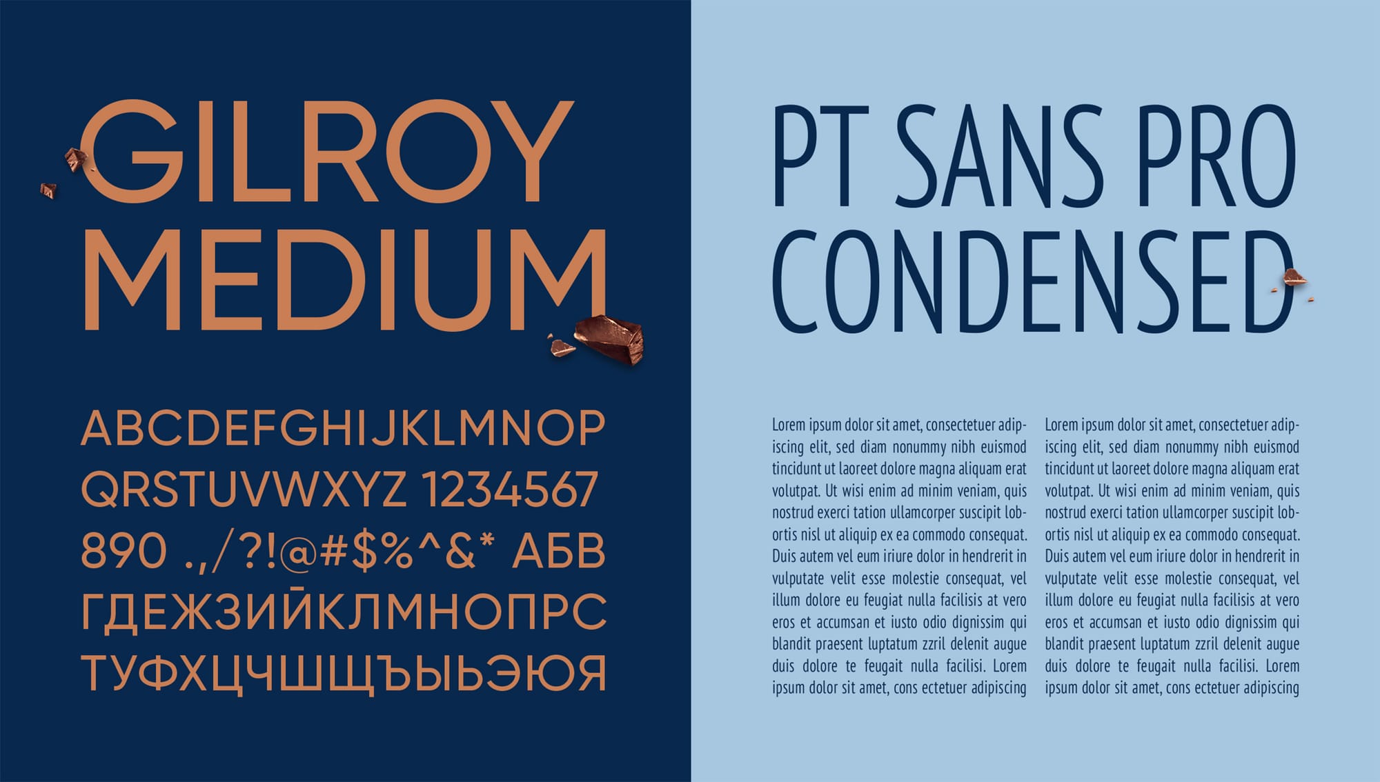
Logo evolution and typography
Starting with the logo, we smoothed out the aggressive curve and only left the essentials- the brand name and the date the factory was founded. Typography was another challenge as we wanted to make the large ingredient blocks easier to read and understand for the average consumer as well as introduce cohesiveness throughout all their different SKUs and sub brands
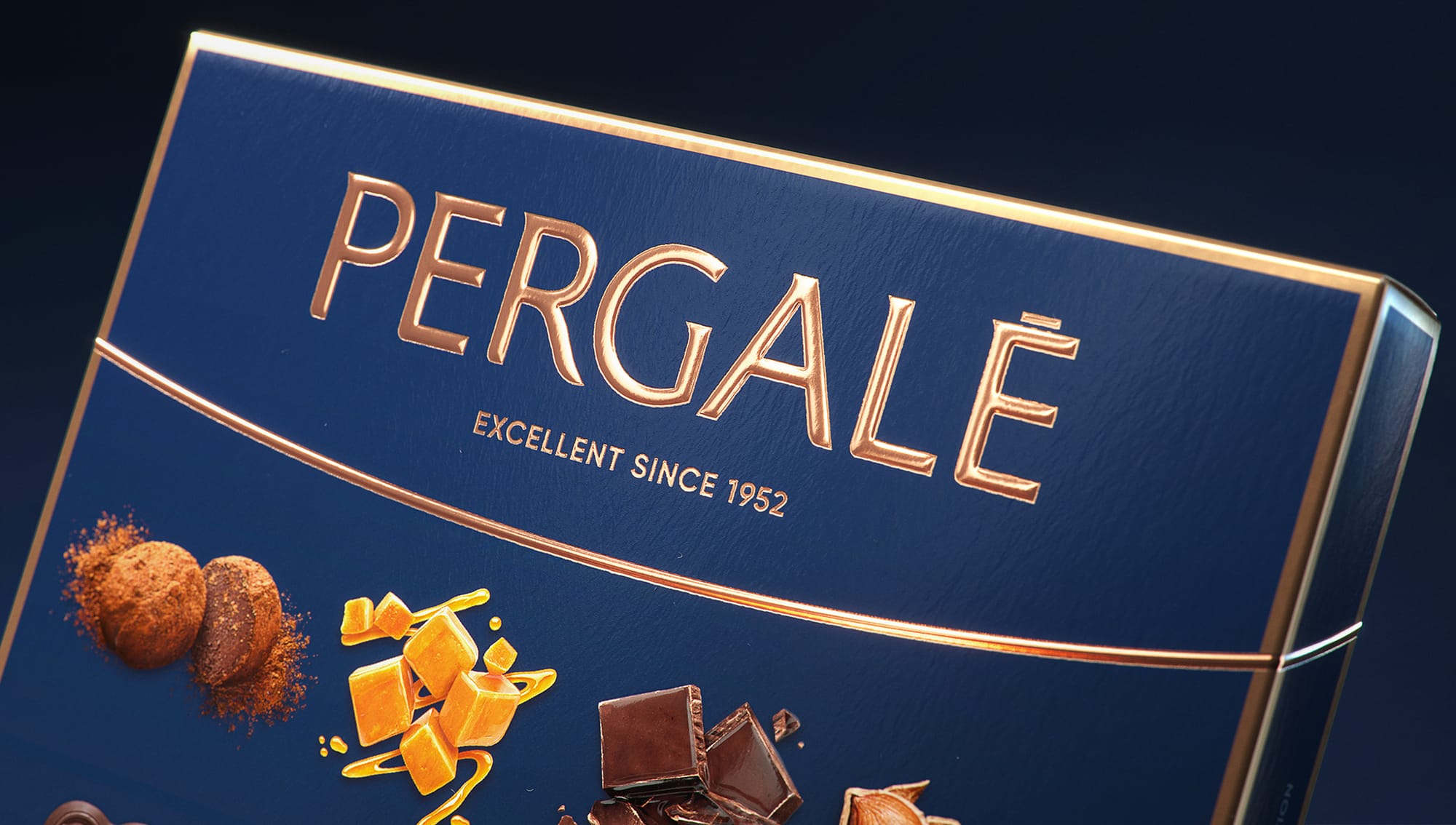
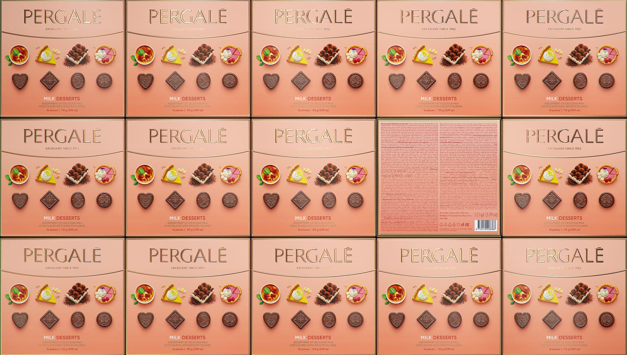
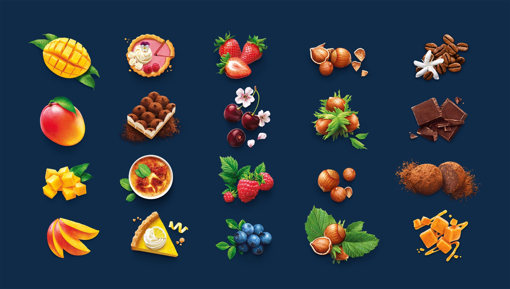
Photorealistic Illustrations- the best of both worlds
By opting for a photorealistic illustration style we wanted to achieve two main goals- to showcase the best possible version of the ingredient, something that wouldn't be possible just through photography alone, as well as create a very distinct look that would be associated with the brand
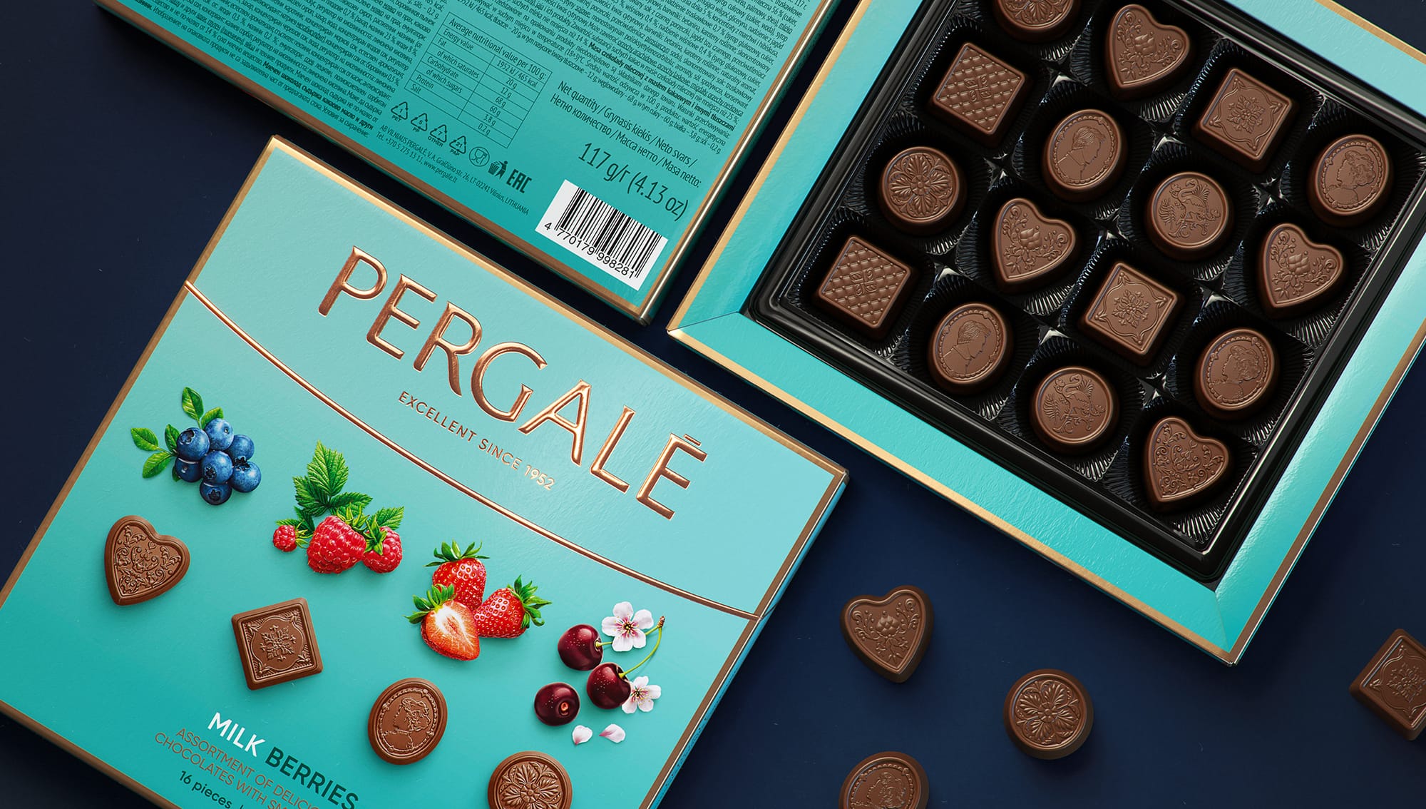
Multiple SKUs
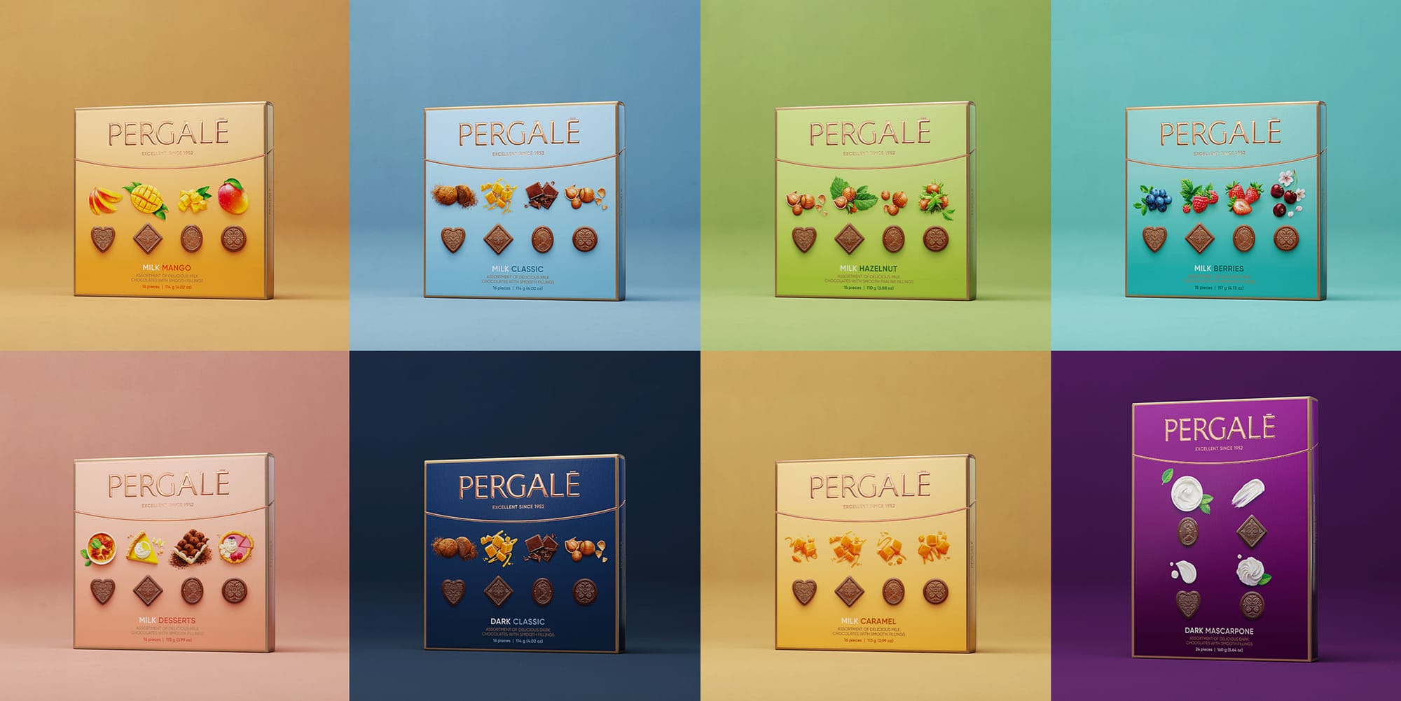
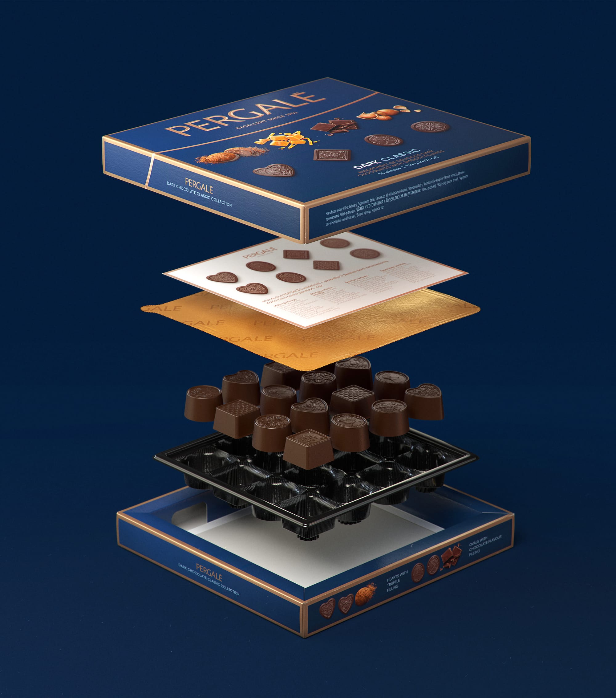
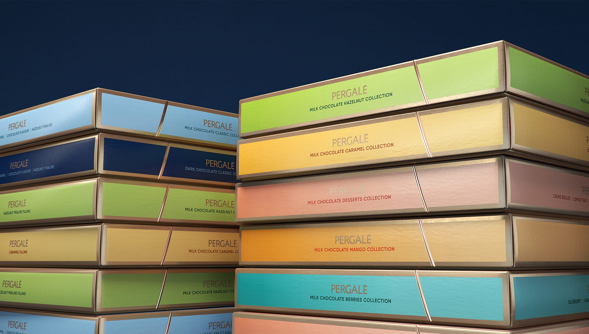
As it was important to maintain cohesiveness through the dozens of different products and sub-brands, we wanted to create a set of visual assets that would look good not only on large surfaces but smaller or irregular packaging as well
Credits
Client: Vilniaus pergalė Head of marketing: Justas Razmus Agency: étiquette Design strategy: Laura Ragaišytė Važgėlienė, Edvardas Kavarskas Art direction: Irmantas Savulionis Design: Beatričė Baronaitė Lau Prepress designer: Daniel Samulevič Account management: Ramunė Baranauskaitė, Rita Dargytė Illustrations: Inorama illustrators 3D Art Direction: Beatričė Baronaitė Lau 3D Artist: Povilas Gavorka