Pergalė Chocolate Bars Rebrand
14/11/2023
Situation
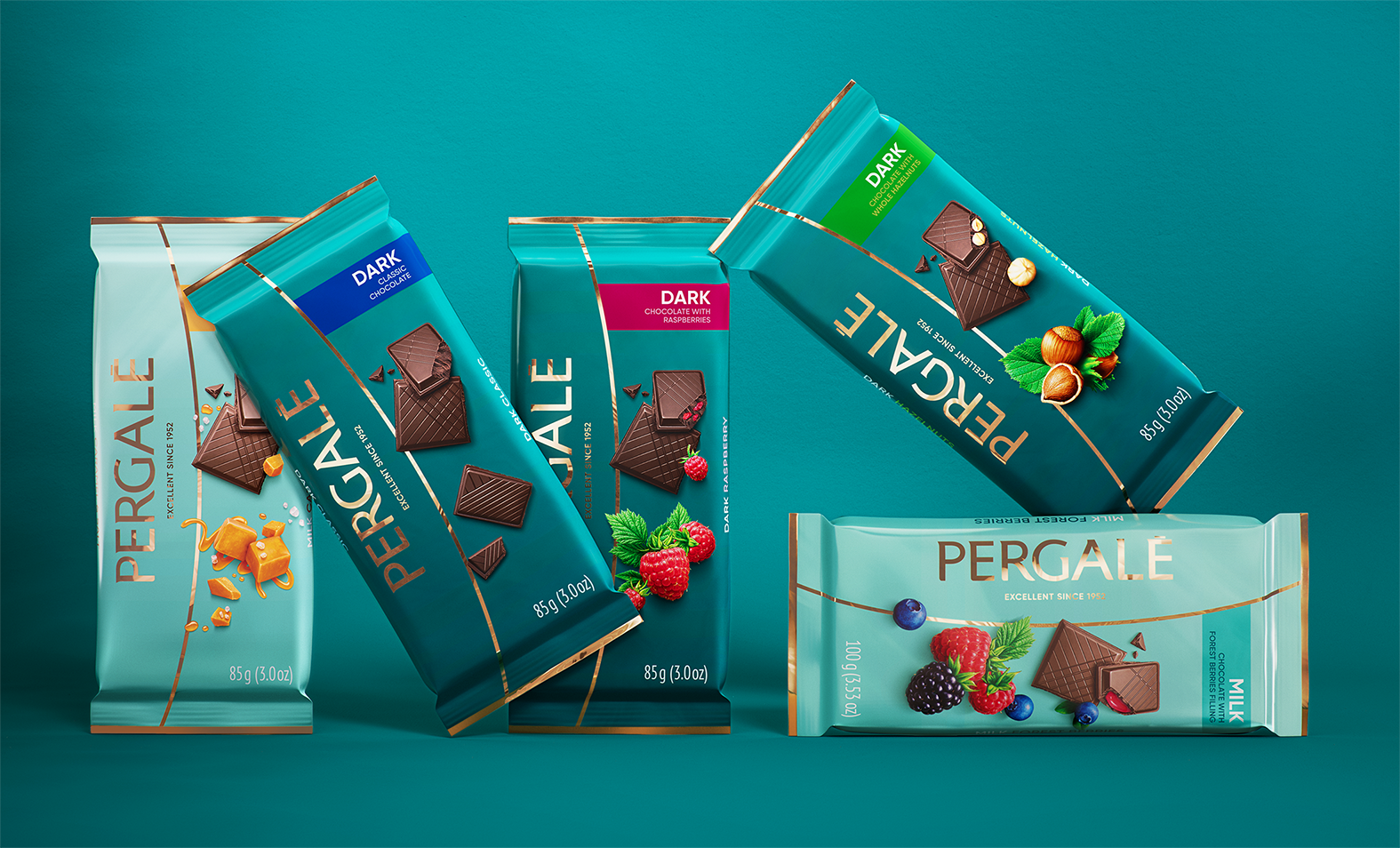
Pergale is one of the oldest and most popular chocolate manufacturers in Lithuania exporting to more than 45 countries globally. Having their last rebrand more than 10 years ago, Pergale started an almost 4-year-long rebranding process across their entire portfolio. Starting with their chocolate boxes 2 years ago, phase two was all about the chocolate bars.

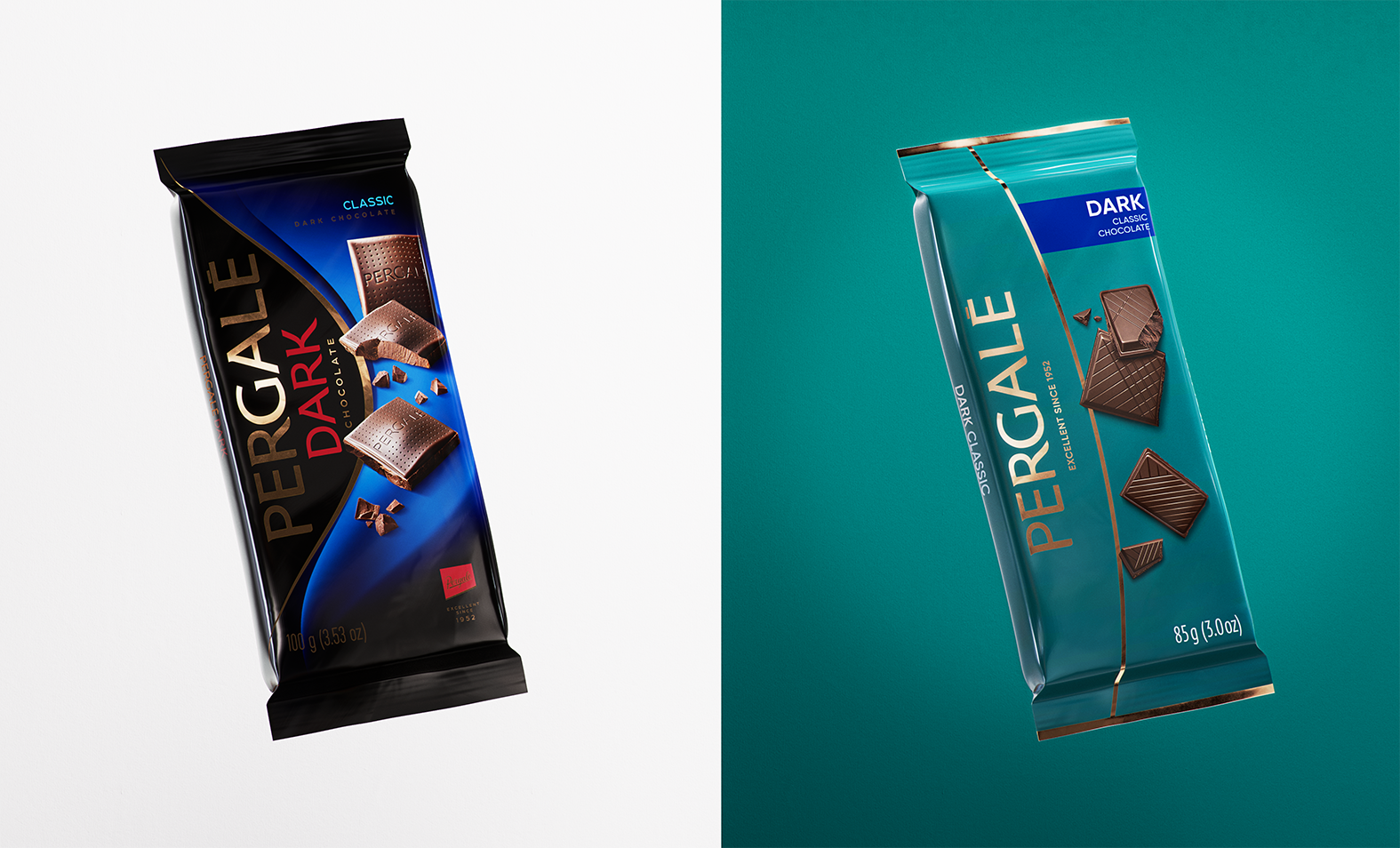
Before and After
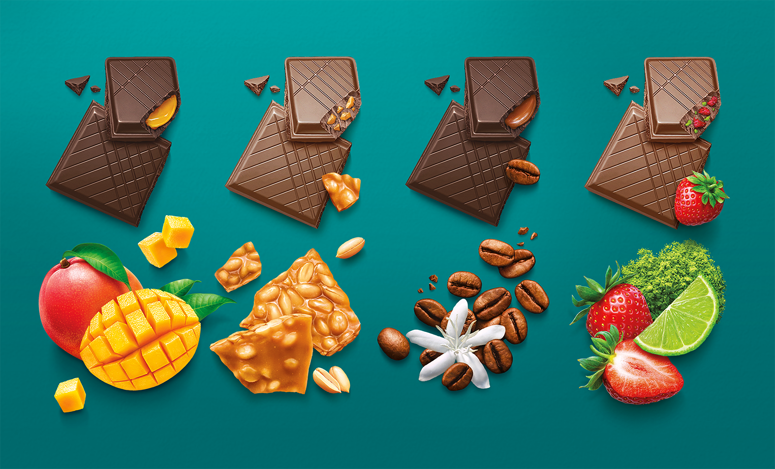
Key visual assets
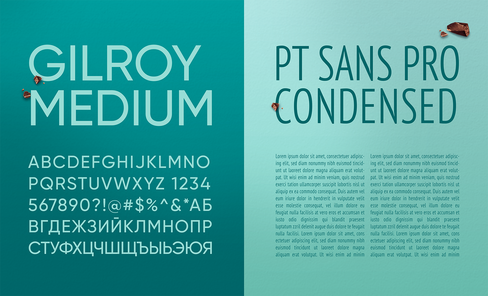
As it was important to maintain cohesiveness through the dozens of different chocolate bars, we wanted to create consistency through our design choices. Firstly, we choose turquoise as our main unifying color for two reasons: high visibility and underutilization in the chocolate market. Secondly, we opted for the same photorealistic style of the ingredient illustrations as we did on the chocolate boxes, to create unity within the brand. And last but not least, we created set rules for typography, continuing what we did with the chocolate boxes a few year prior, choosing Gilroy and PT Sans Pro as our main fonts.
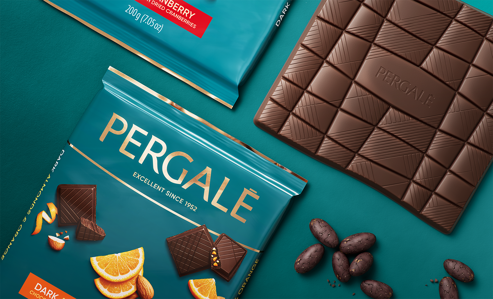
New Chocolate Mould
We created this somewhat unique and unusual chocolate bar shape for Pergale to distance themselves from their more generic counterparts. Curved side lines echo the same curved line that is visible in the logo, while the debossed logo in the middle further solidifies a unique brand experience that only Pergale can offer.


Credits
Client: Vilniaus pergalė Head of marketing: Justas Razmus Agency: étiquette Design strategy: Laura Ragaišytė Važgėlienė, Edvardas Kavarskas Art direction: Beatričė Baronaitė Lau Design: Beatričė Baronaitė Lau Prepress designer: Daniel Samulevič Account management: Leta Lileikytė, Ramunė Slepovė Mould Art Director: Irmantas Savulionis Mould Design: Artūras Kirslys Illustrations: Inorama illustrators 3D Art Direction: Beatričė Baronaitė Lau 3D Artist: Povilas Gavorka